Research & Analysis
I started this project by creating a mood board in Pinterest. I was drawn to bright colors and patterns that were found in wallpapers, textiles, and other graphics.
These bright colors inspired me and I found that they evoked many of the same feelings that Scandinavian folk art did. Feelings of youth, excitement and playfulness. I decided that I wanted a lot of my project to be pattern based while still having a clean and modern feel.
Playing with pattern
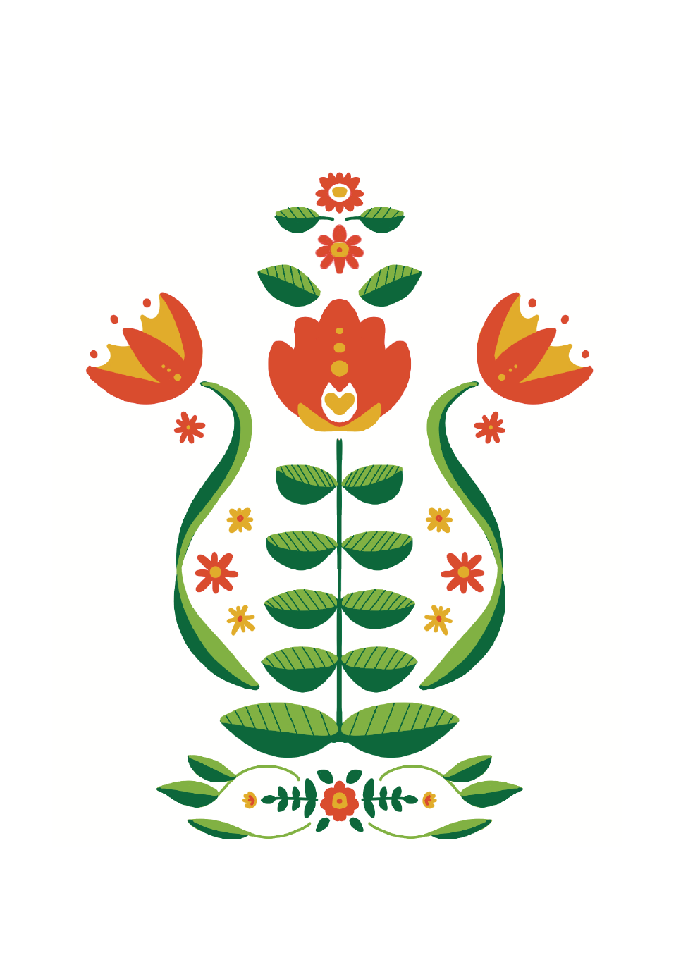
I was and still am very intrigued by Swedish and Scandinavian folk art. The art is symmetrical, but unexpected. It consists of quite often bright colors, florals, and animals. I decided that I wanted to try creating my own Swedish patterns. This was a lot of fun and lead to me creating a brand with a lot of ideas drawn from these beautiful patterns and florals, although simplified.
Designing a Logo
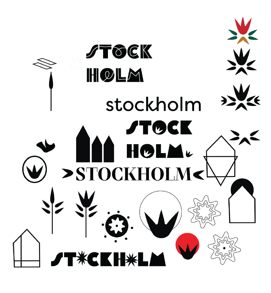
The first task for this assignment was to design a logo. I thought this wouldn’t be a big deal, that I would just make some floral, abstract, minimal design. However, I tried that and it didn’t seem to work. It didn’t have the “umph” that I wanted, and certainly didn’t give any credit to the beautiful city of Stockholm.
Rinse and Repeat
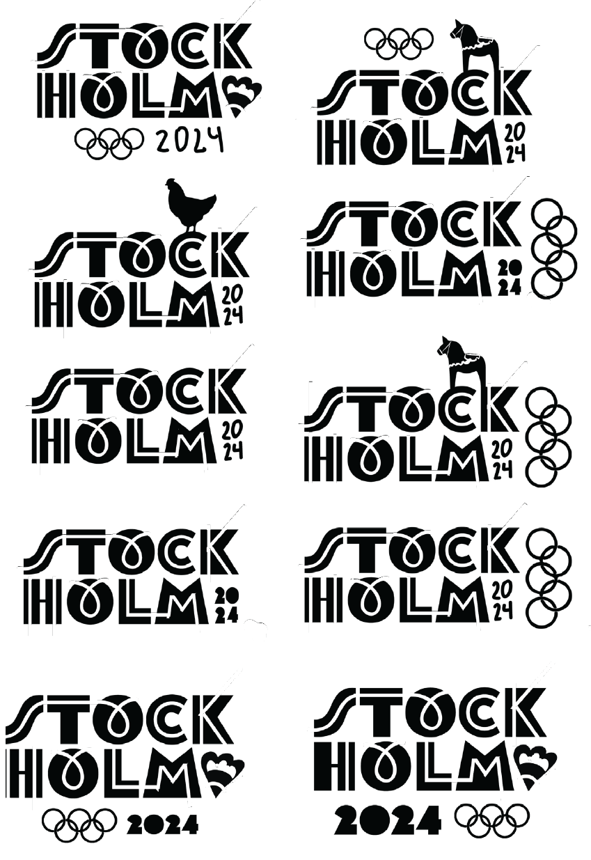
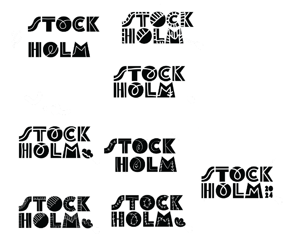
Of all the logos I had done, I felt like the blocky letters with the white line running through it was my strongest design. From there, I repeated it over and over again. I would add elements, take them away, and try new things. At one point I even had a Swedish Flower Hen as part of my design. Seeing as most people don’t know a ton about chickens, and with the advice of my professor, I decided that chickens weren’t the best part of my design.
I love this design because it’s fun, and holds some sense of traditional folk art. Not only that, I felt it represented the beautiful, clean and historic city of Stockholm.
Final Logo
Behind the Scenes Design
Now that I had a logo, I had the task of creating business cards, a letterhead, and envelope that members of the International Olympic Committee could use. Not only that, but other employees working to put on the Stockholm Summer Games. It’s a lot of work and no one wants to go unrecognized for the important role they are playing. However, these are not elements that the public would see, just those working to put the games together.
I hand drew each of the patterns used to create these stationary elements, and then mocked them up in Photoshop.
Acts of Desperation
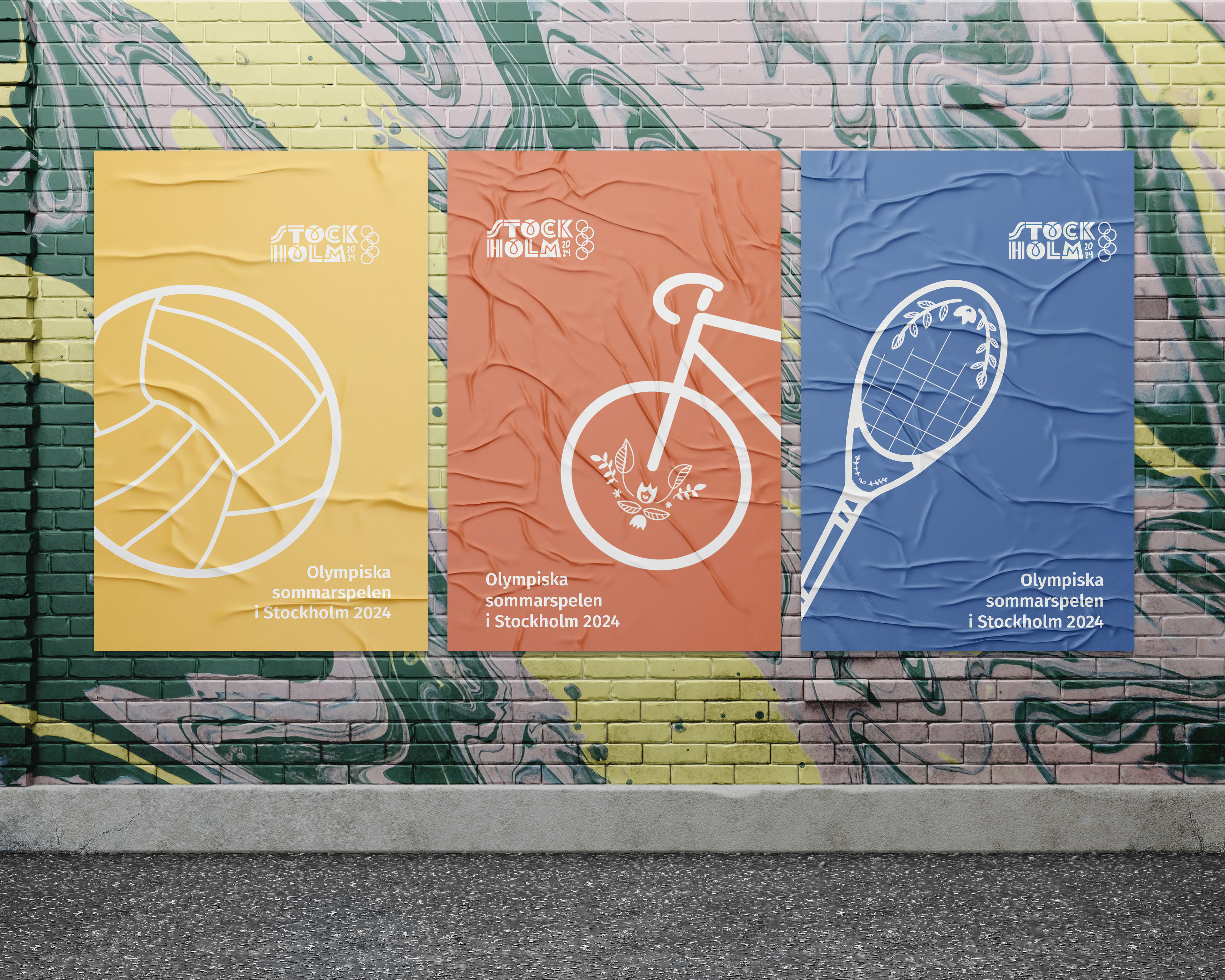
Creating Posters was probably the hardest part of this project for me. I felt like I had no ideas. I did a brain dump on a piece of paper but nothing seemed to work out. I finally had an idea of a swimmer in a canal, I started, and then the document didn’t save to my cloud documents. It wouldn’t save to my external hard drive either. I had to start over, and then it didn’t turn out to be a very good design.
As an act of desperation, I decided to hand draw some illustrations that might match the style of my business cards. They were simple, but powerful. And fun and colorful! It’s amazing how sometimes brilliance seems to strike us in our moments of despair.

Wayfinding & Tickets
I then designed wayfinding icons. I also hand illustrated these and added floral elements, in order to create visual unity between all of my designs.
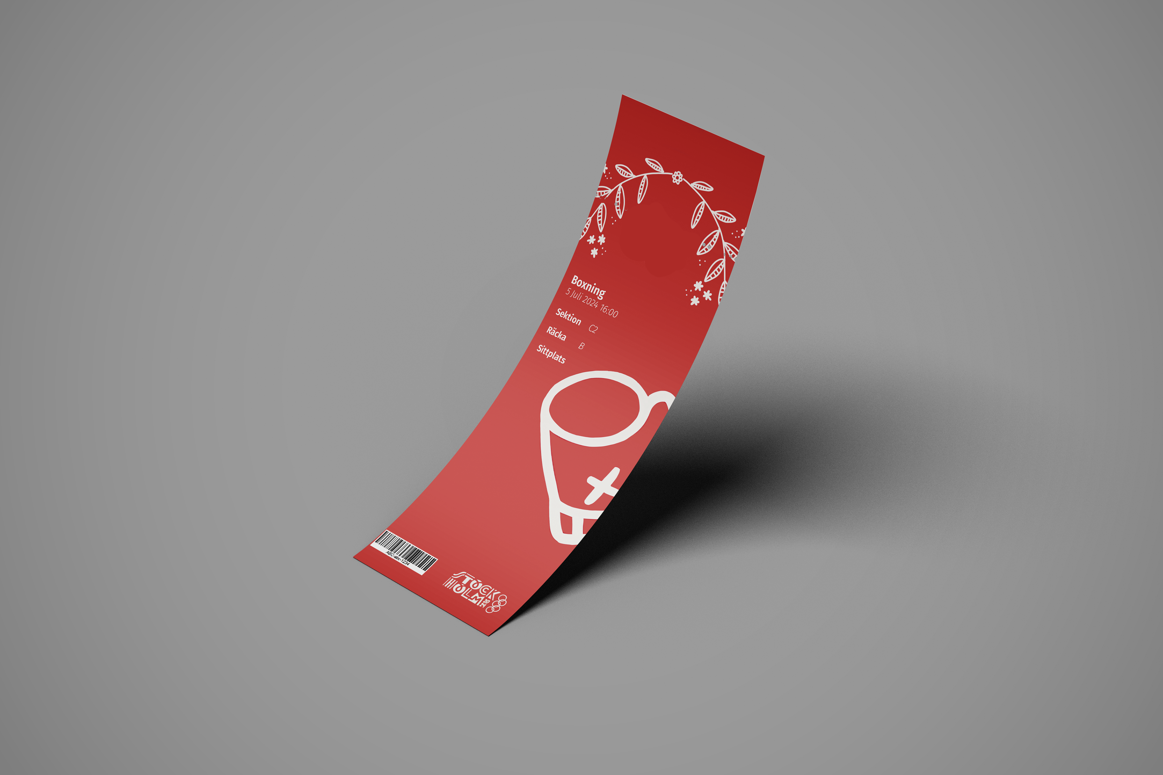
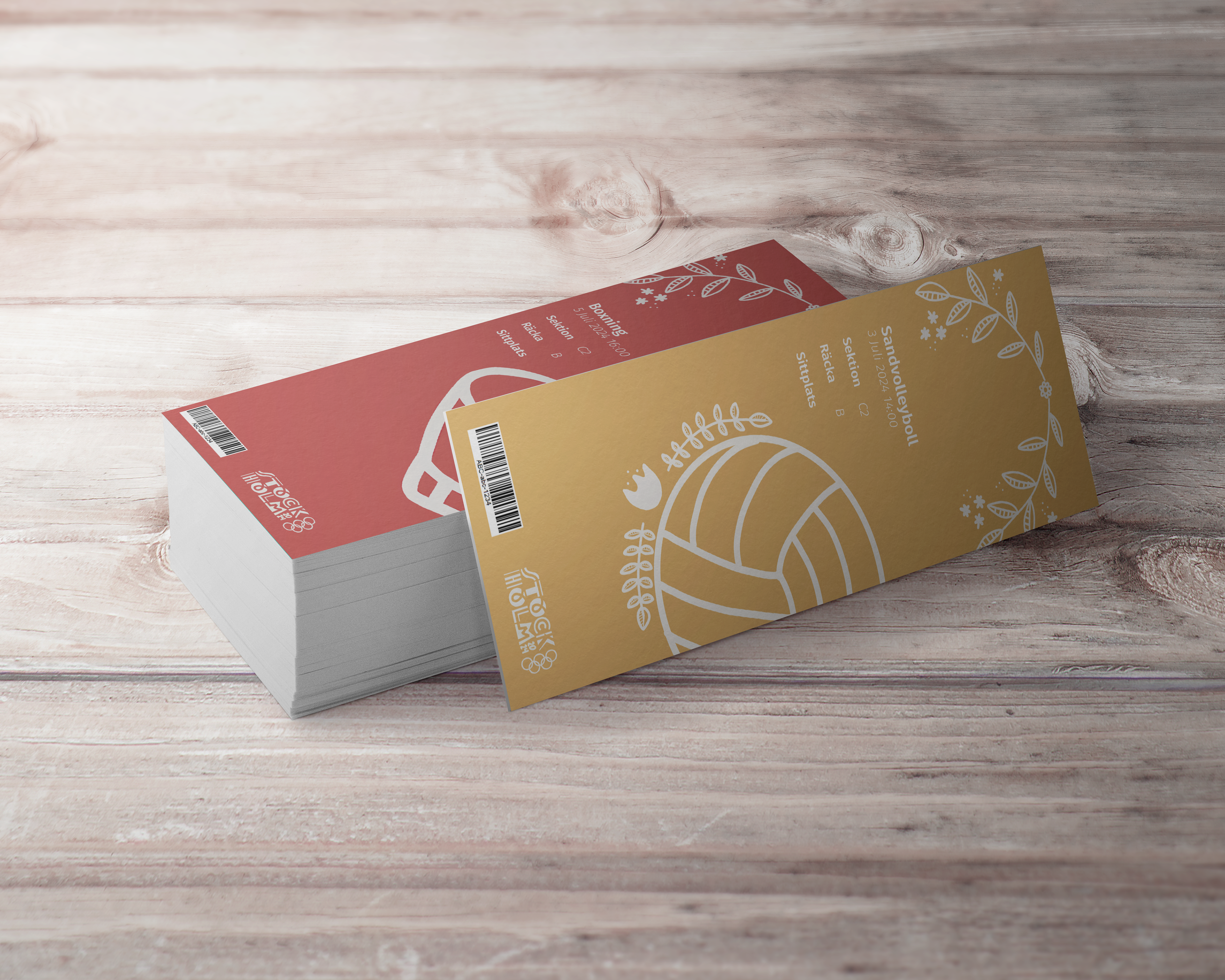
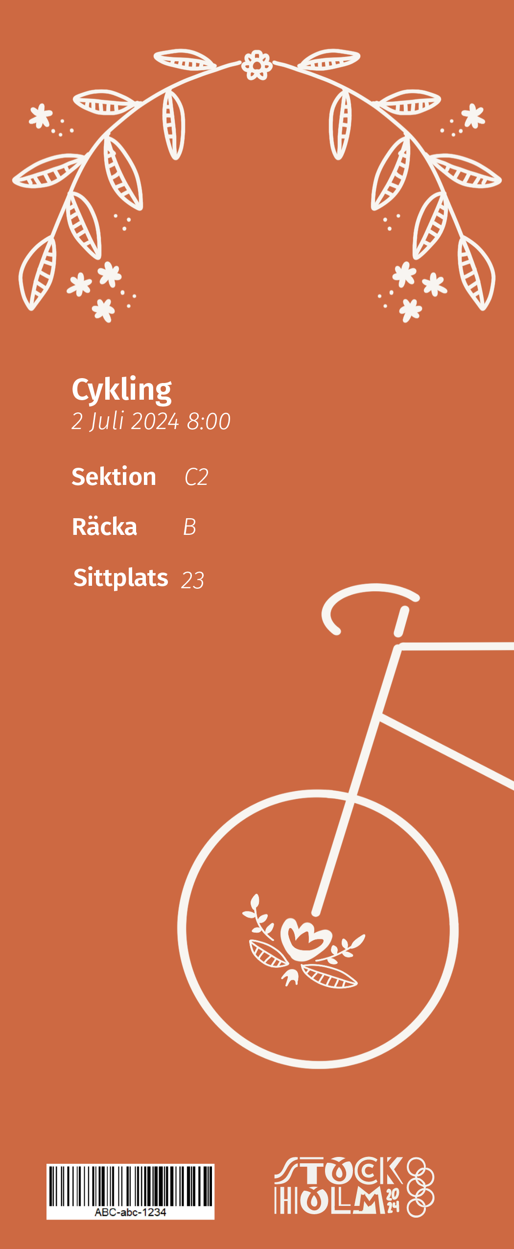
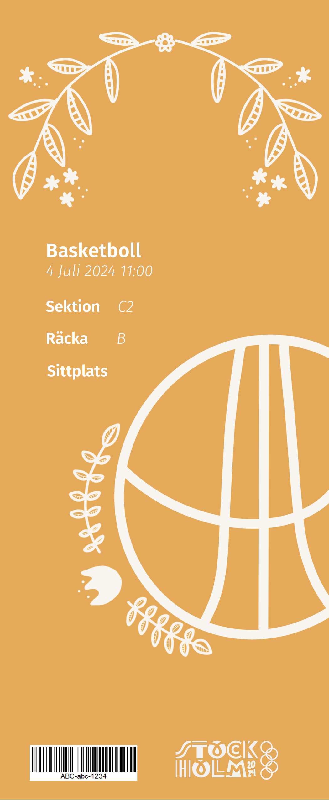
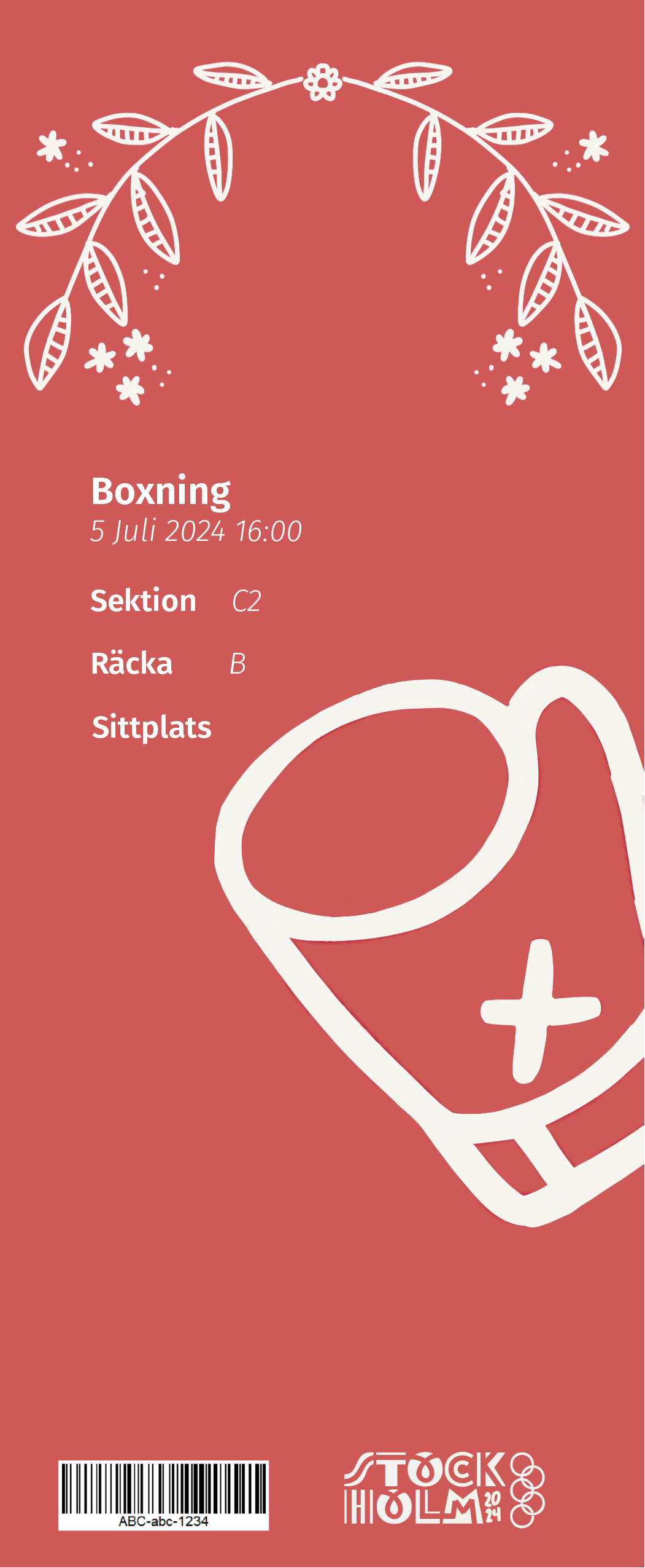
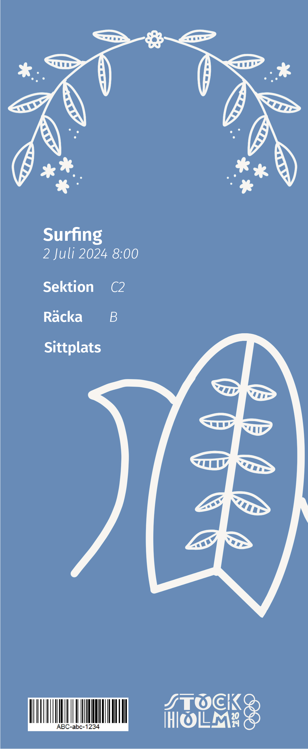
Similar to my posters, I created my tickets with simple illustrations, and added the event title, date, time and seating information to the tickets. Creating the tickets was probably one of my favorite parts of this project.
